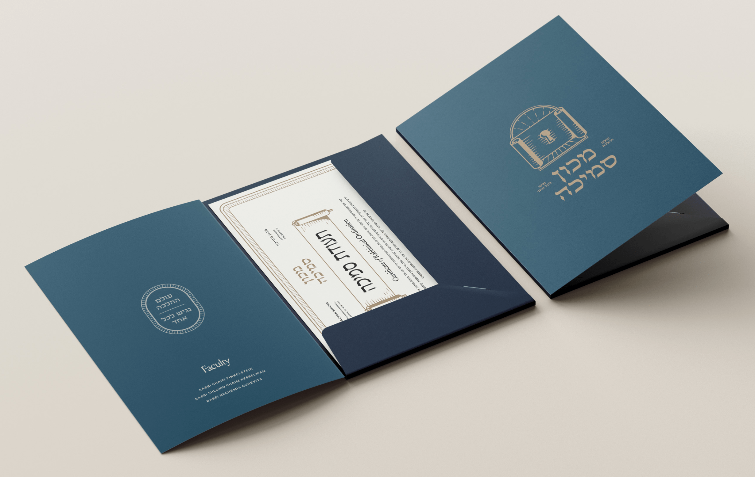

The Torah School of Greater Washington is a deeply rooted Orthodox Jewish day school, built by and for its community. While newer, more modern-looking school options were entering the market, The Torah School wanted to clearly and confidently articulate who they truly are today: a warm, academically strong institution grounded unapologetically in Torah and Torah values. Motif was brought in to refresh the brand and align the school’s visuals and messaging with the reality families experience every day inside its walls.
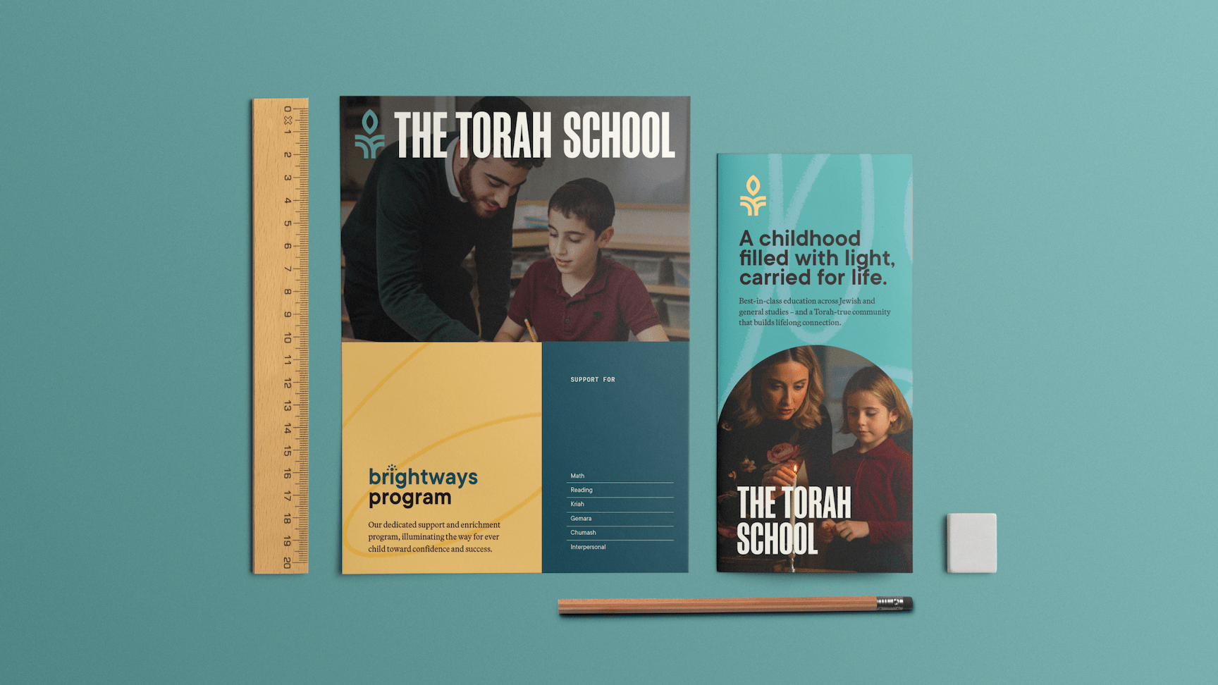


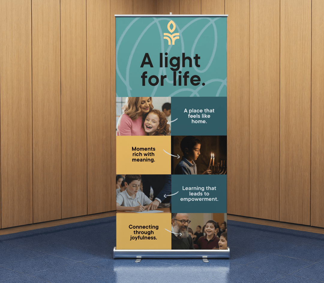
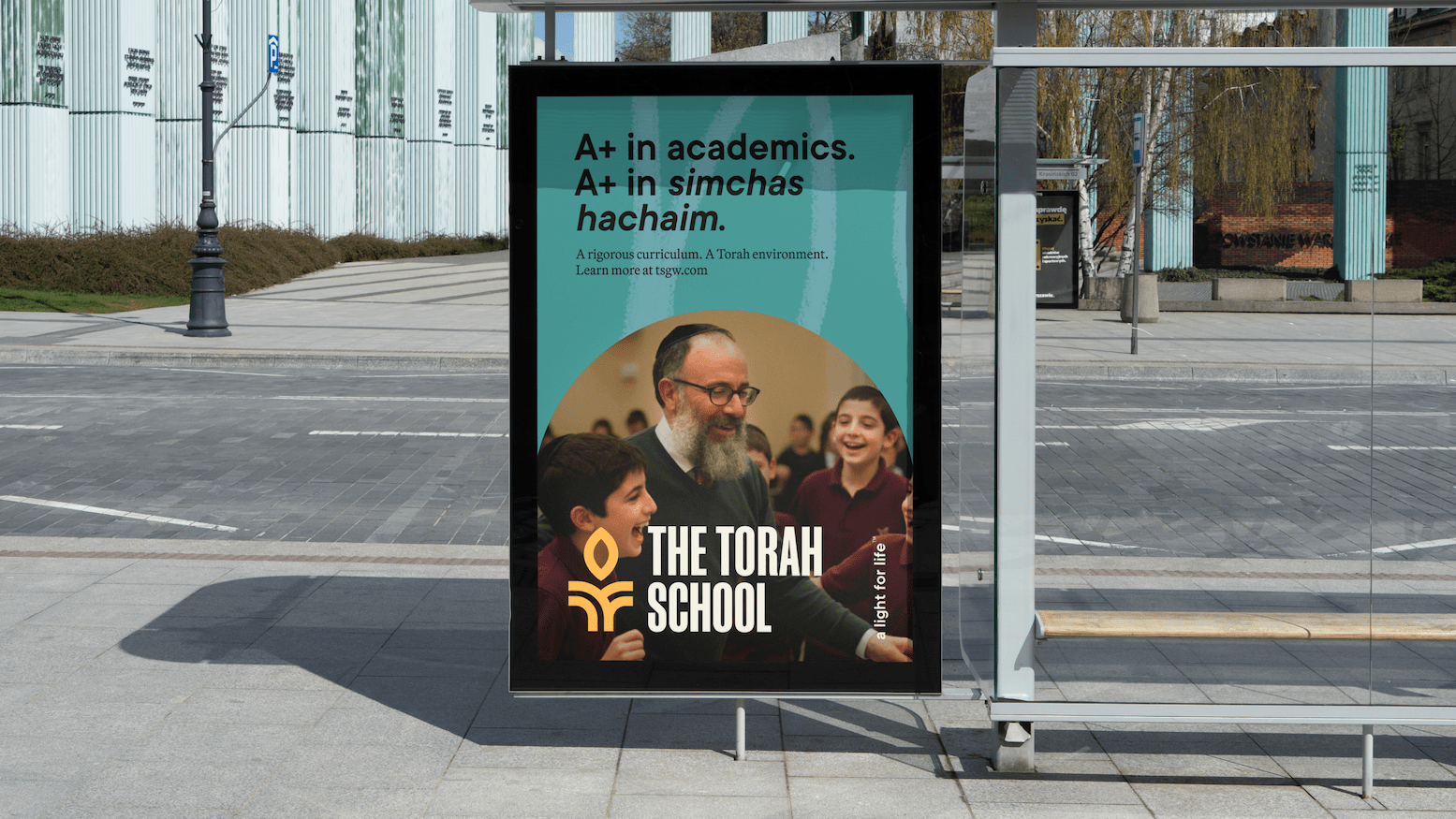
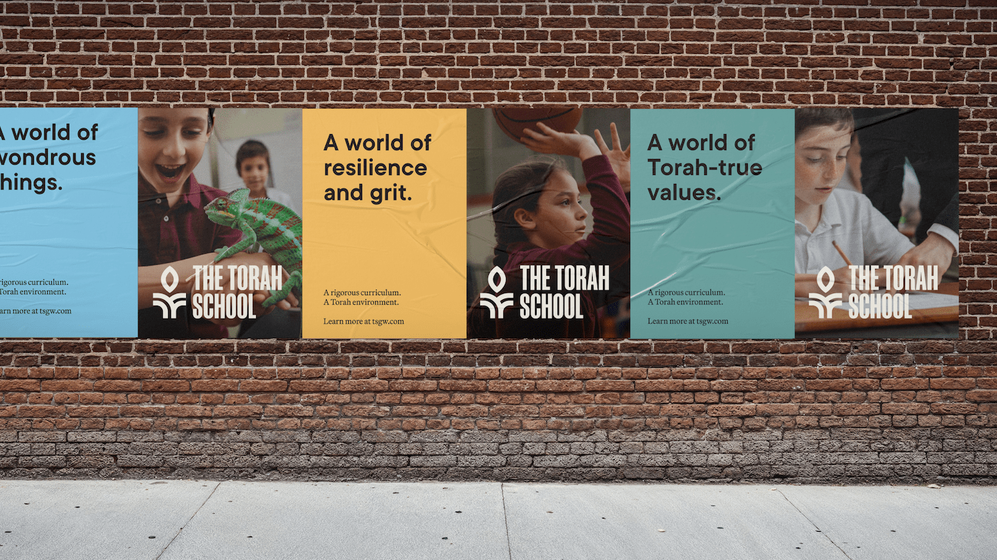
This project was about clarity and conviction. The messaging needed to remind families why Torah matters — not just as a subject, but as a way of life that shapes identity, values, and family culture. We crafted language that positions Torah as the guiding light of the school, woven into every part of a child’s education — alongside rigorous general studies. The result is a narrative that speaks directly to parents who want their children academically prepared and deeply grounded, without compromise.
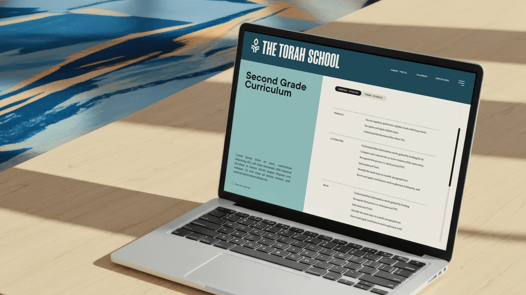

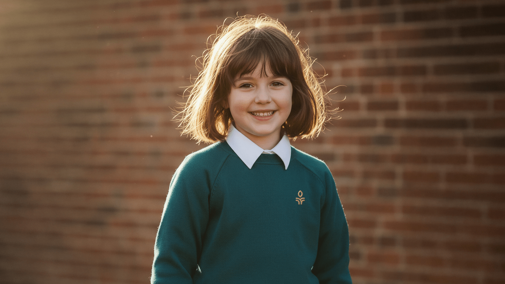
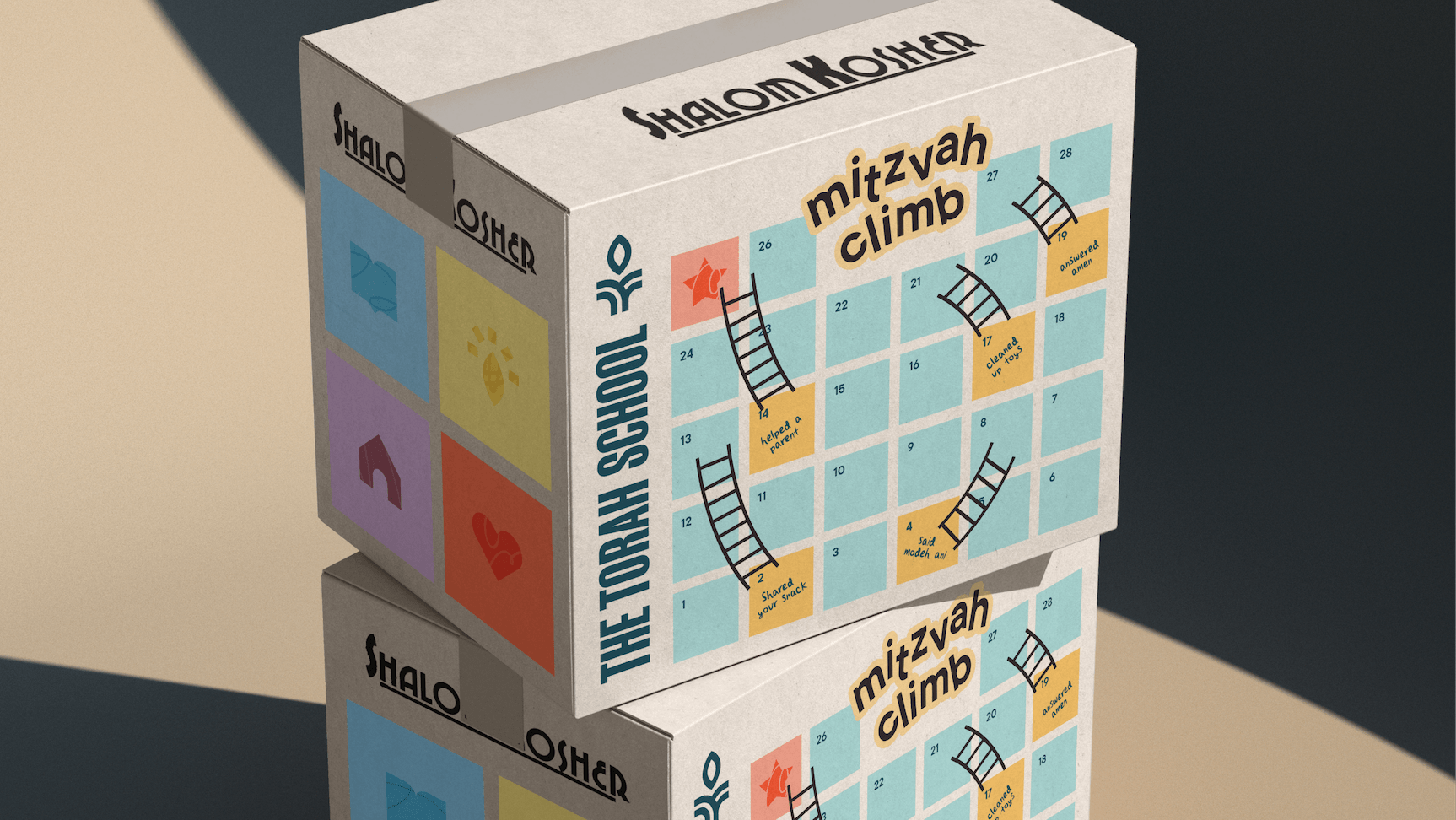
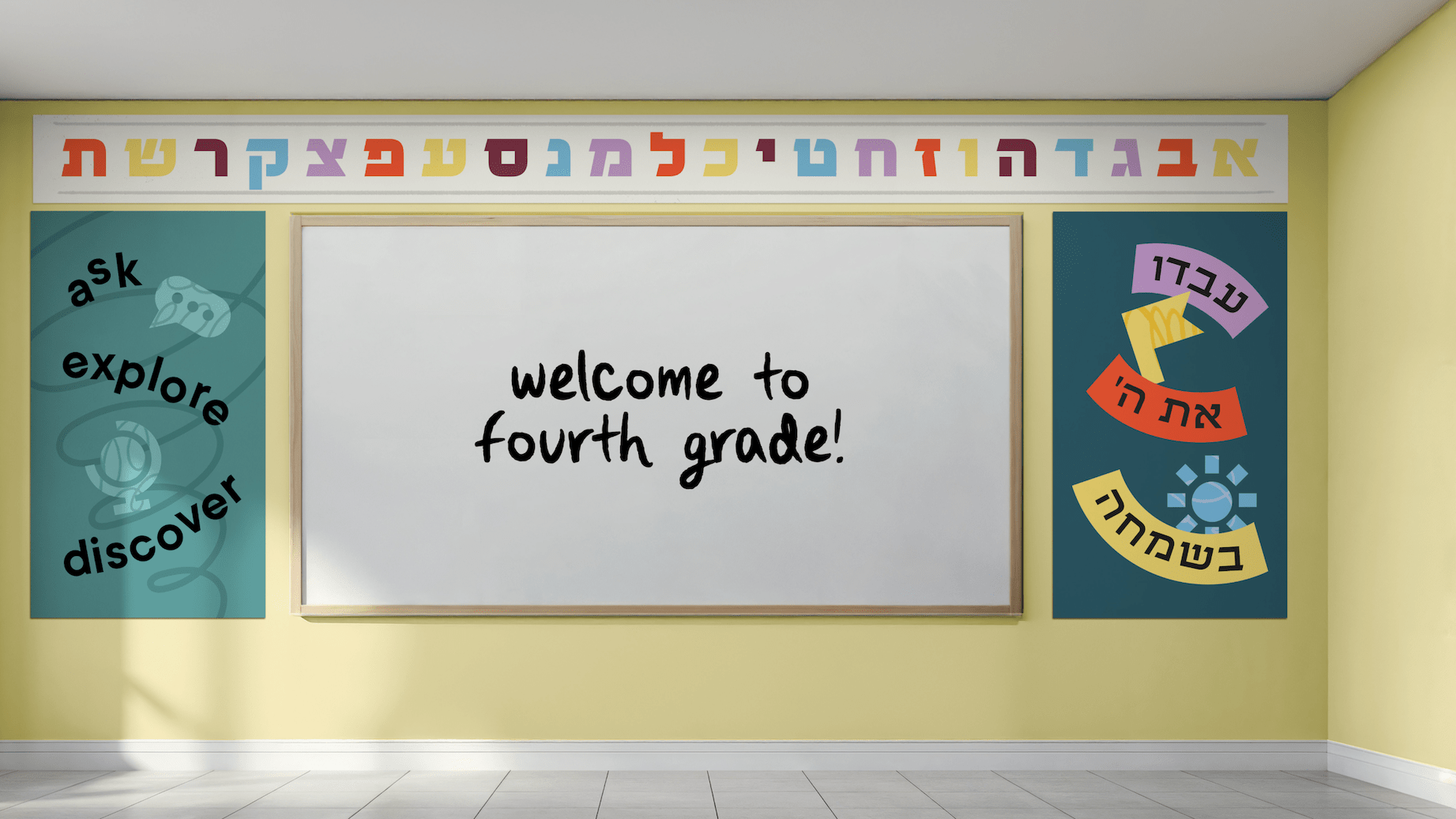
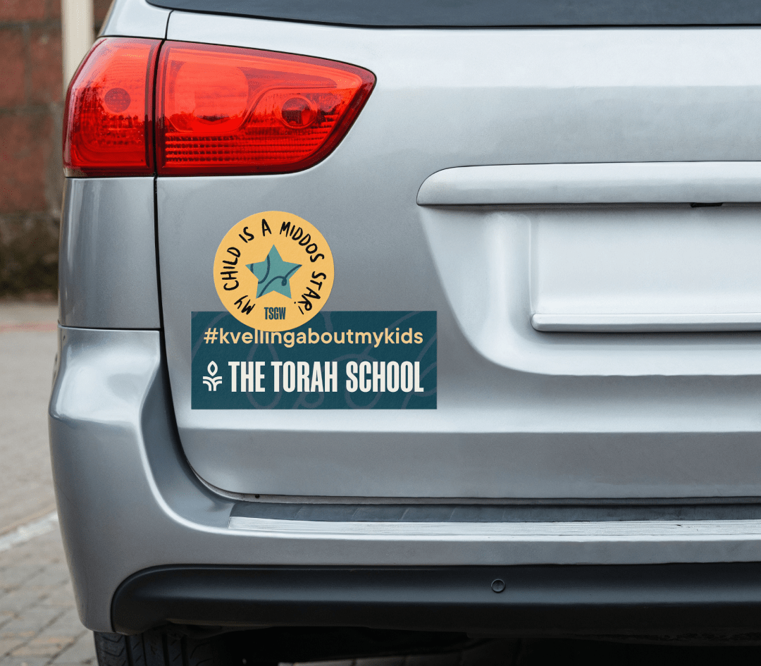
The new visual system is modern and energetic, but never cold or overly minimal. Bright, joyful colors, expressive iconography, and a warm typographic palette create a feeling of light, optimism, and belonging. The identity feels current and confident while remaining cozy, human, and values-driven — reinforcing that this is a school where children are known, supported, and nurtured.


.svg)