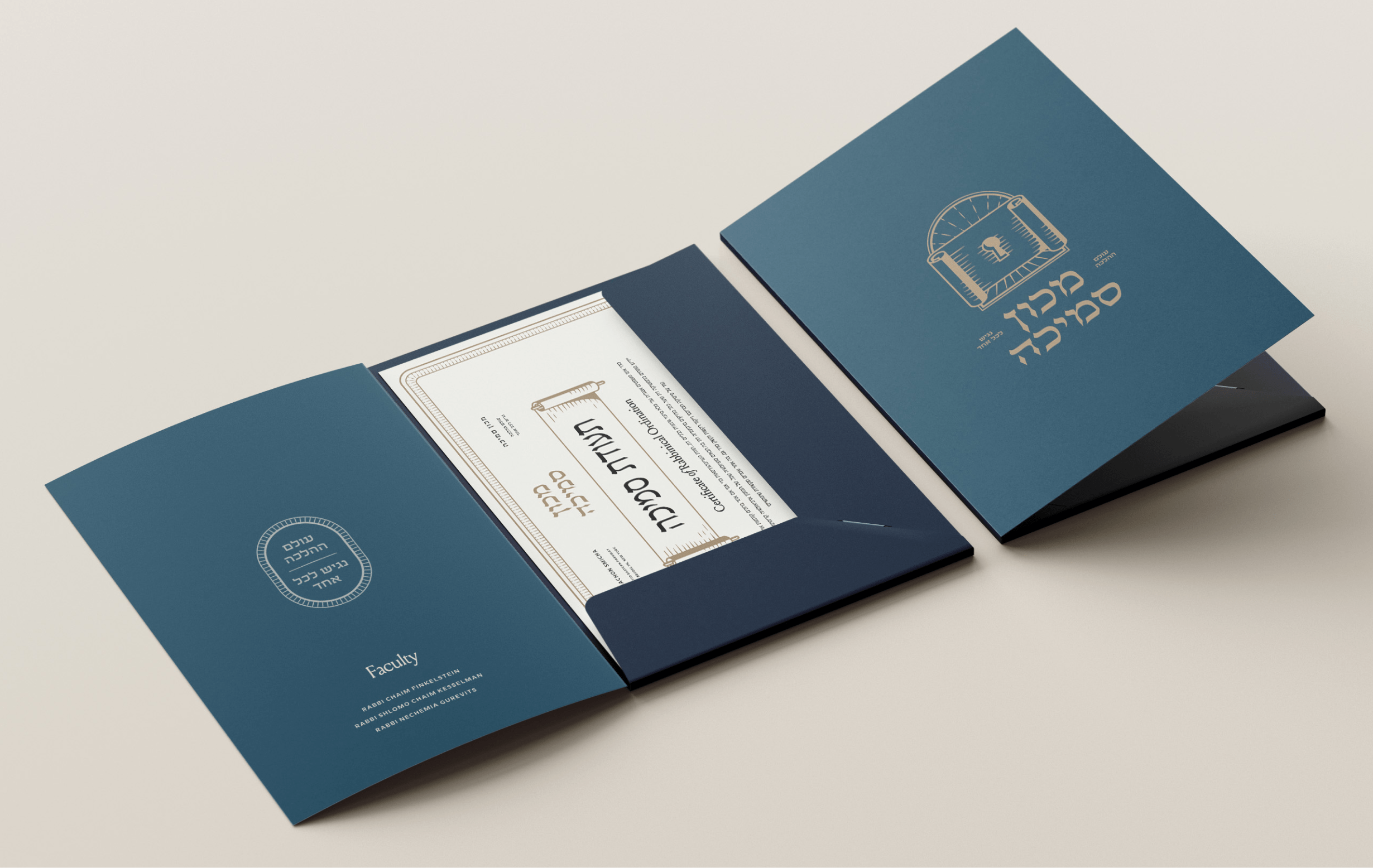
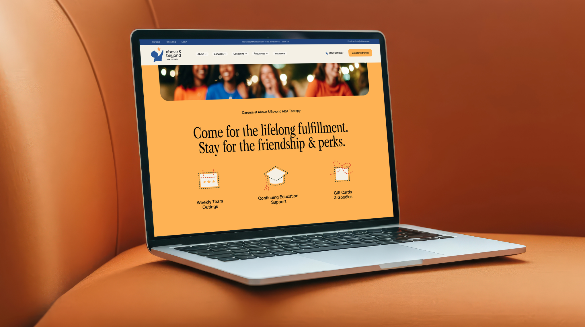
Above & Beyond ABA is a large, well-established ABA provider with locations across multiple states and a strong reputation in the field. Despite their success, their visual identity had fallen behind — beginning to signal neglect rather than care. Motif was brought in to create a new brand that felt refreshed and elevated, without alienating the families they serve or drifting into an overly modern, high-end aesthetic.
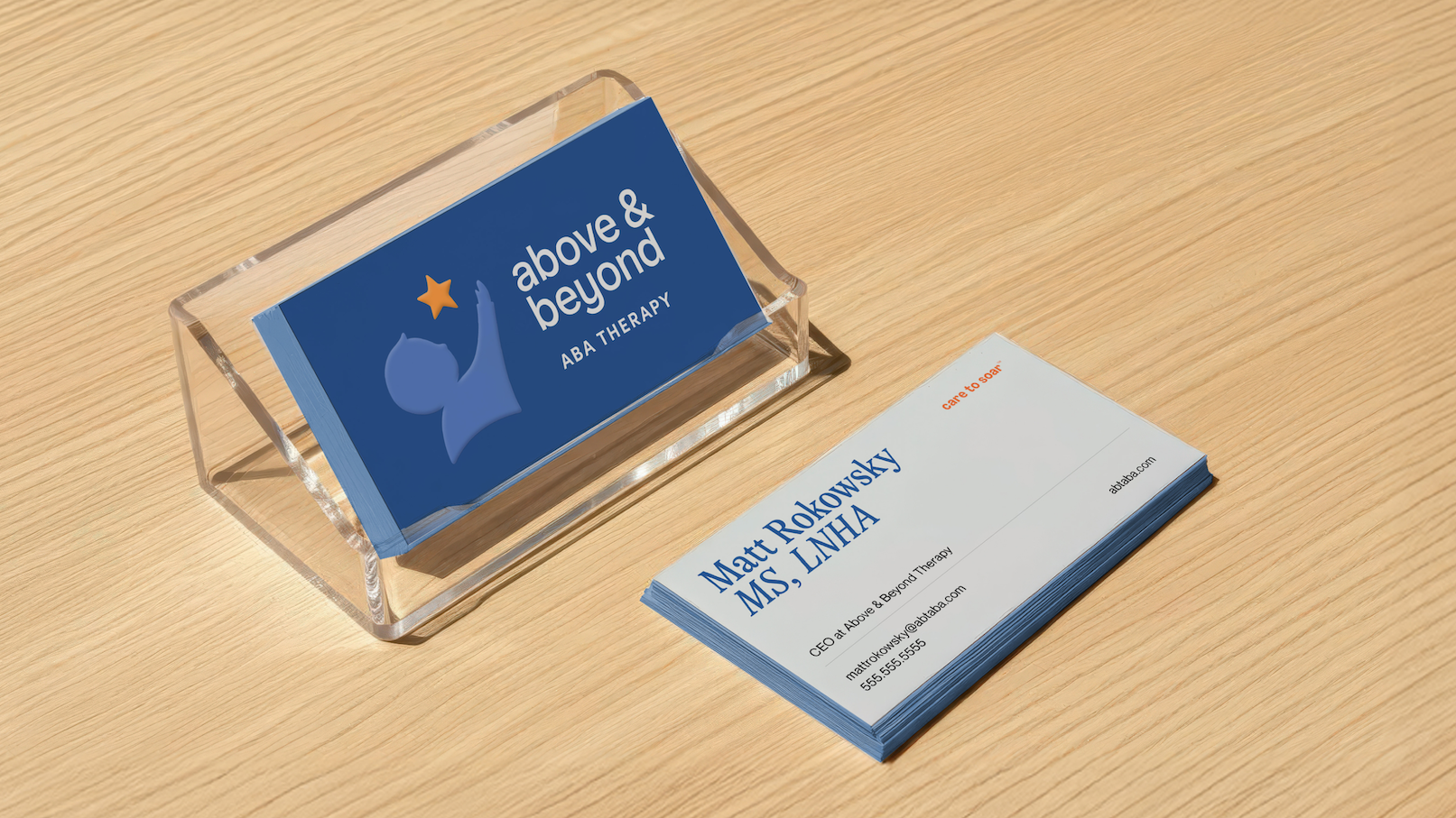
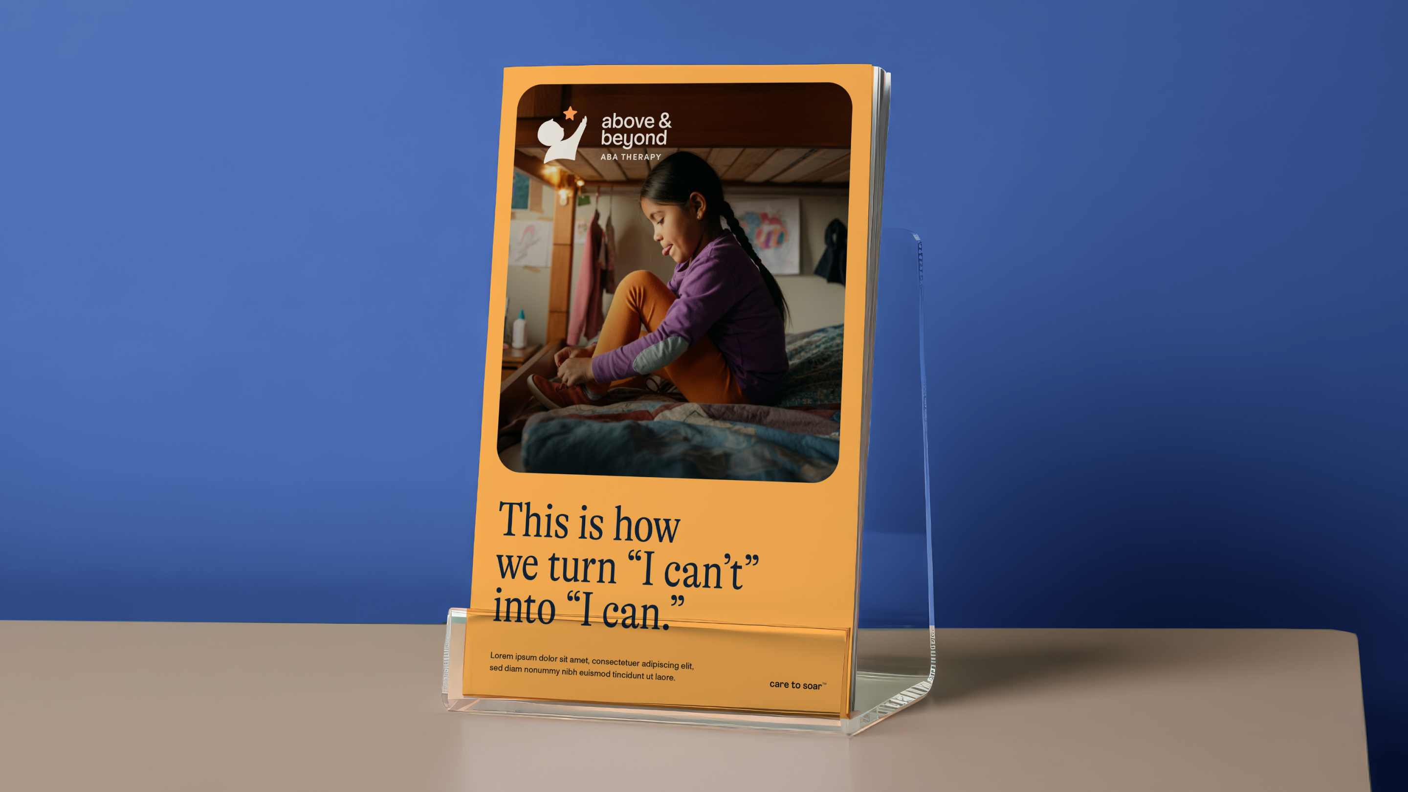
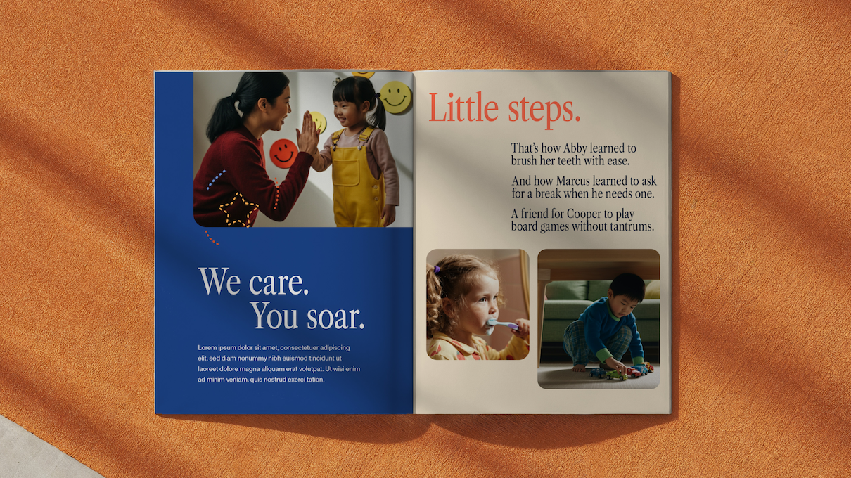
The guiding principle was restraint. This brand needed to feel warm, approachable, and deeply human — not sleek, fanciful, or expensive. Above & Beyond serves families from largely low-income communities, with services covered by Medicaid, and the brand needed to reflect dignity, care, and accessibility. We intentionally avoided muted palettes and ultra-minimal marks in favor of something brighter, friendlier, and more emotionally resonant.

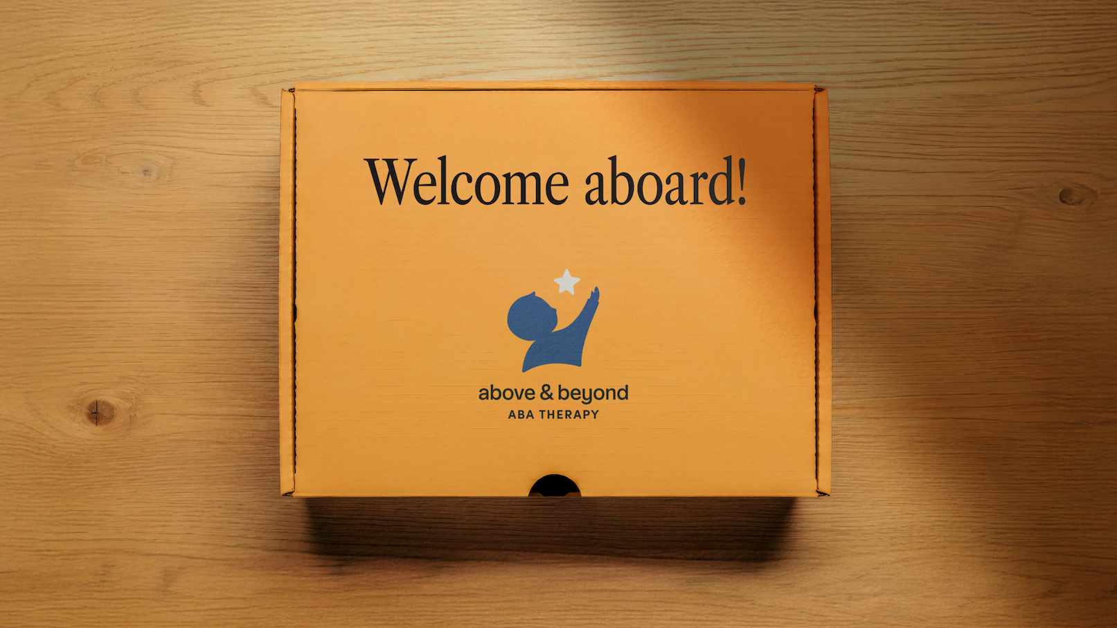
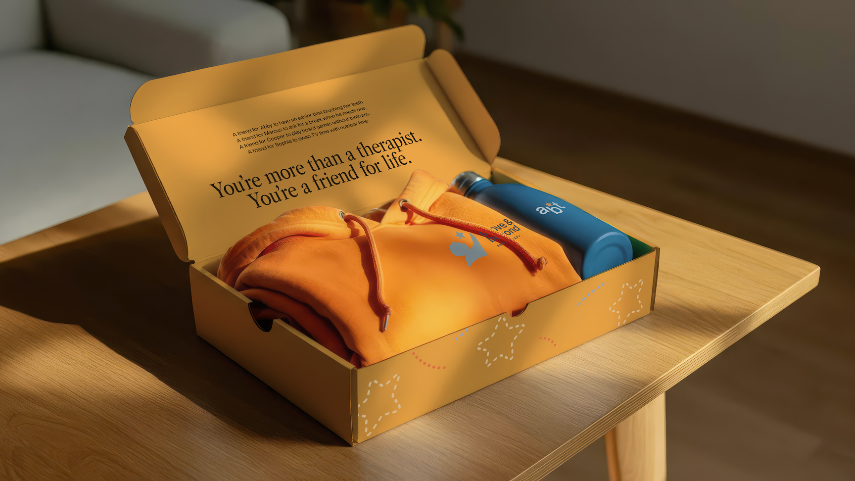

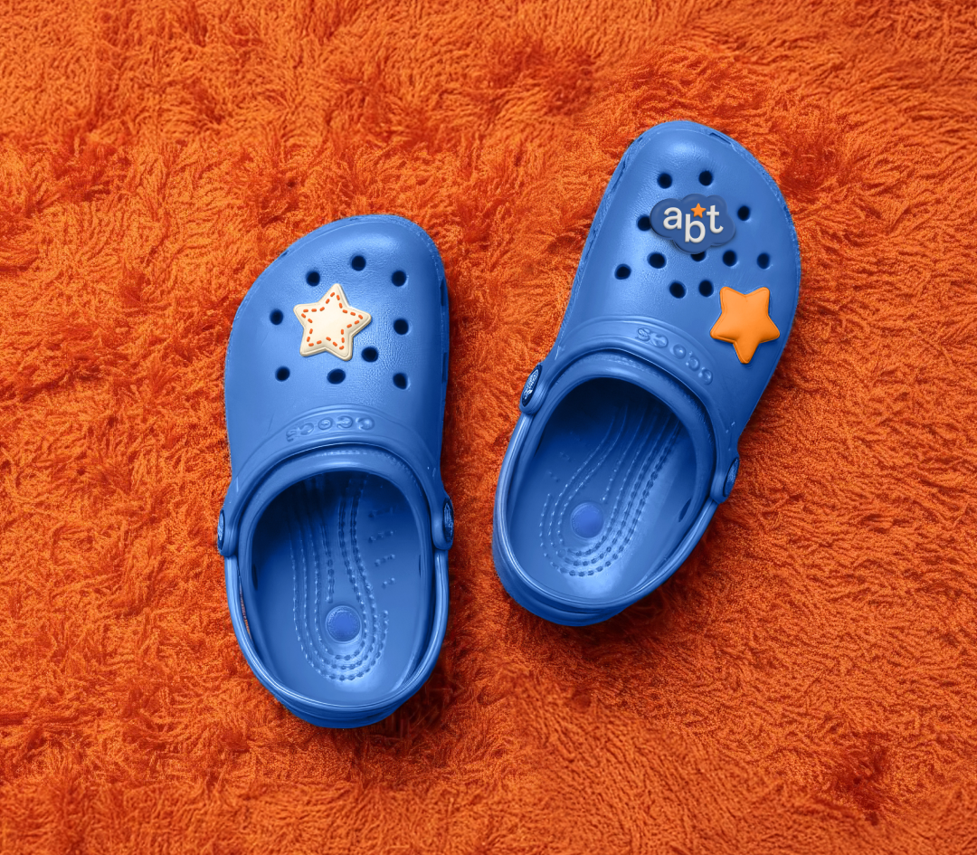
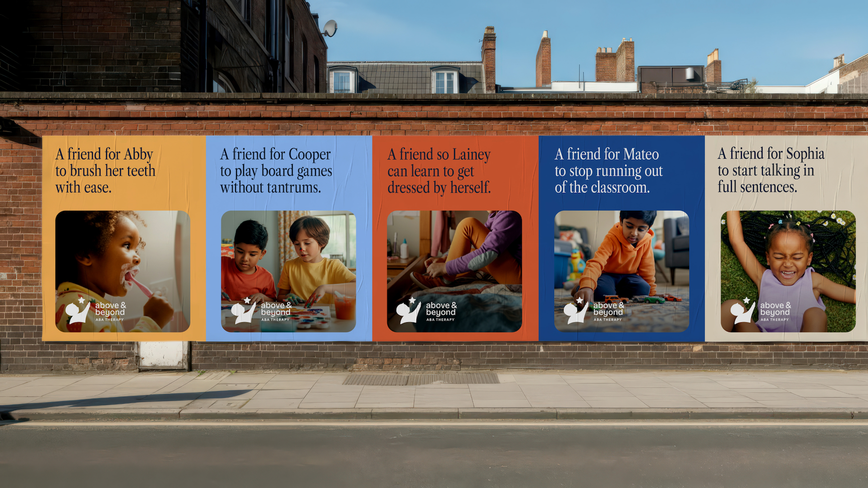
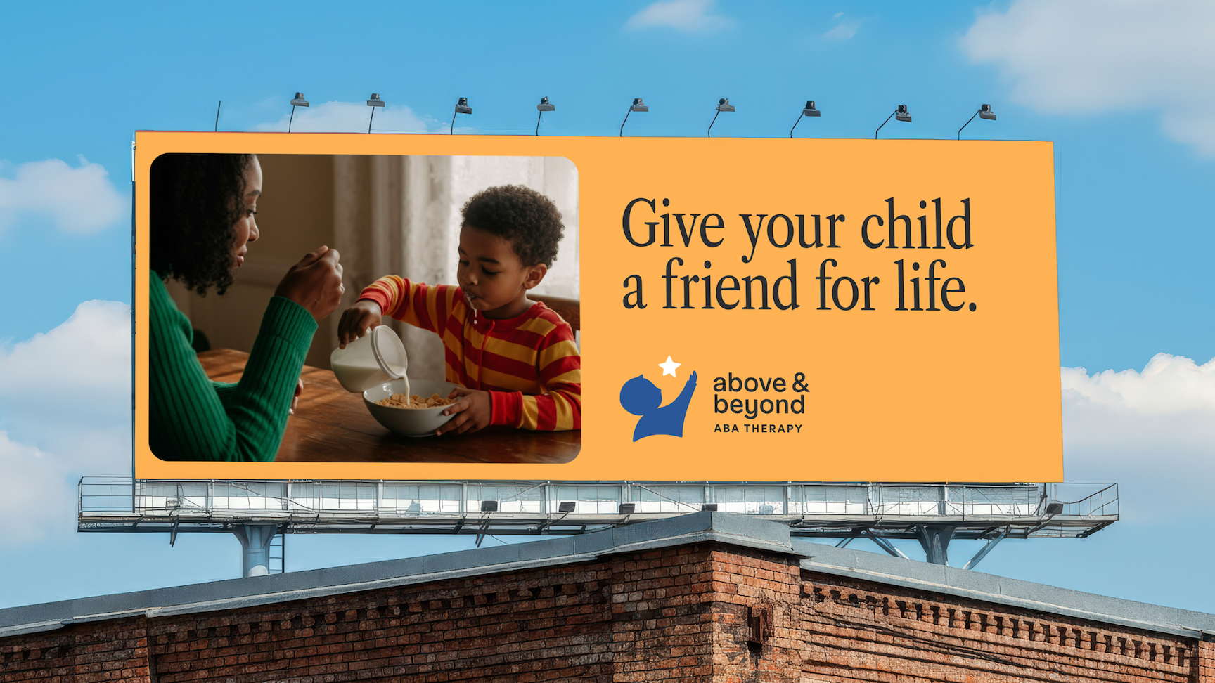
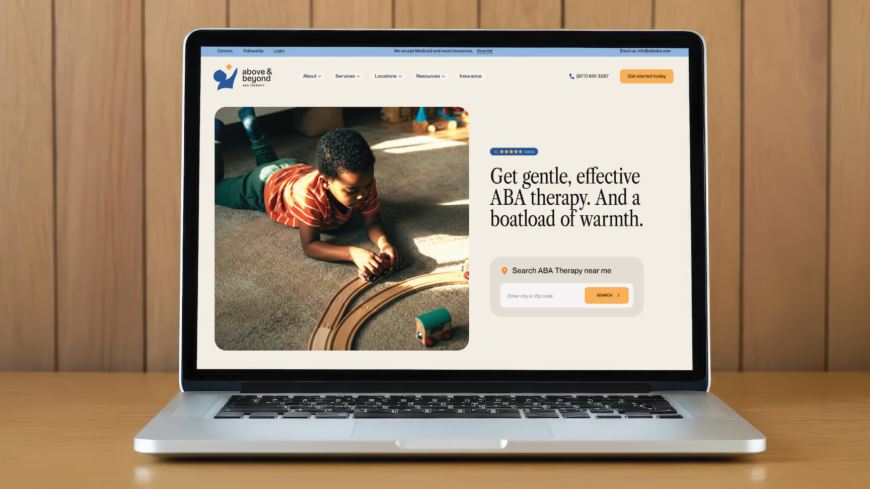
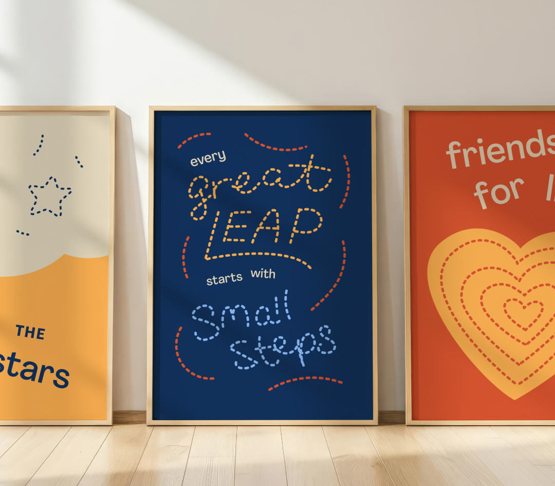
The new identity uses bold, joyful colors, a friendly logotype, and a detailed, human icon. Everything is designed to feel supportive and safe. The visual language embraces warmth and optimism, reinforcing the idea that this is a place where children are understood, supported, and genuinely cared for. Photography focuses on real families in real homes. This down-to-earth approach helps families see themselves reflected in the brand, building trust before a single word of copy is read.
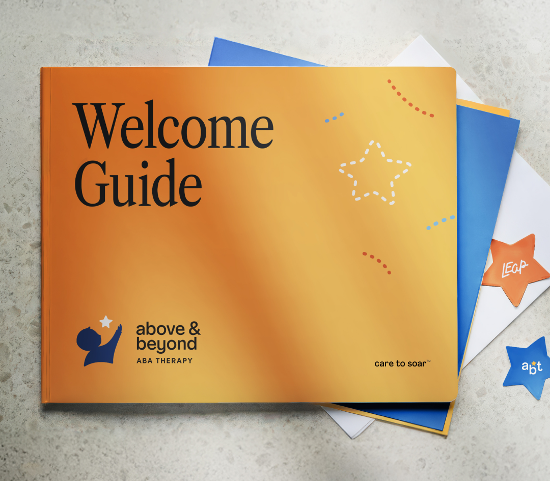
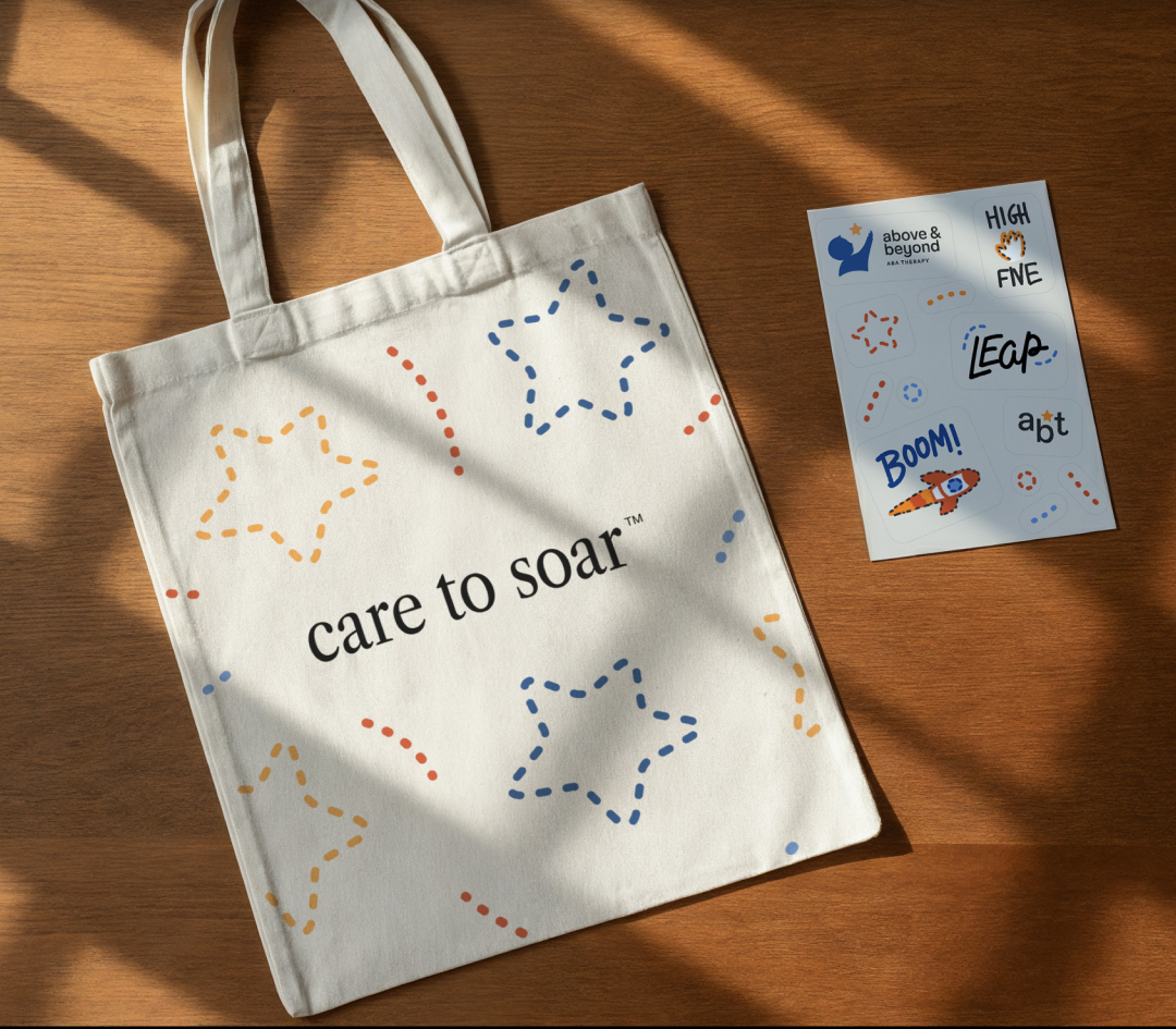
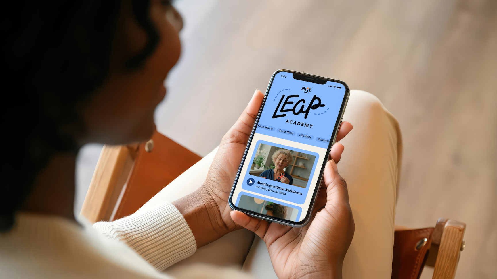
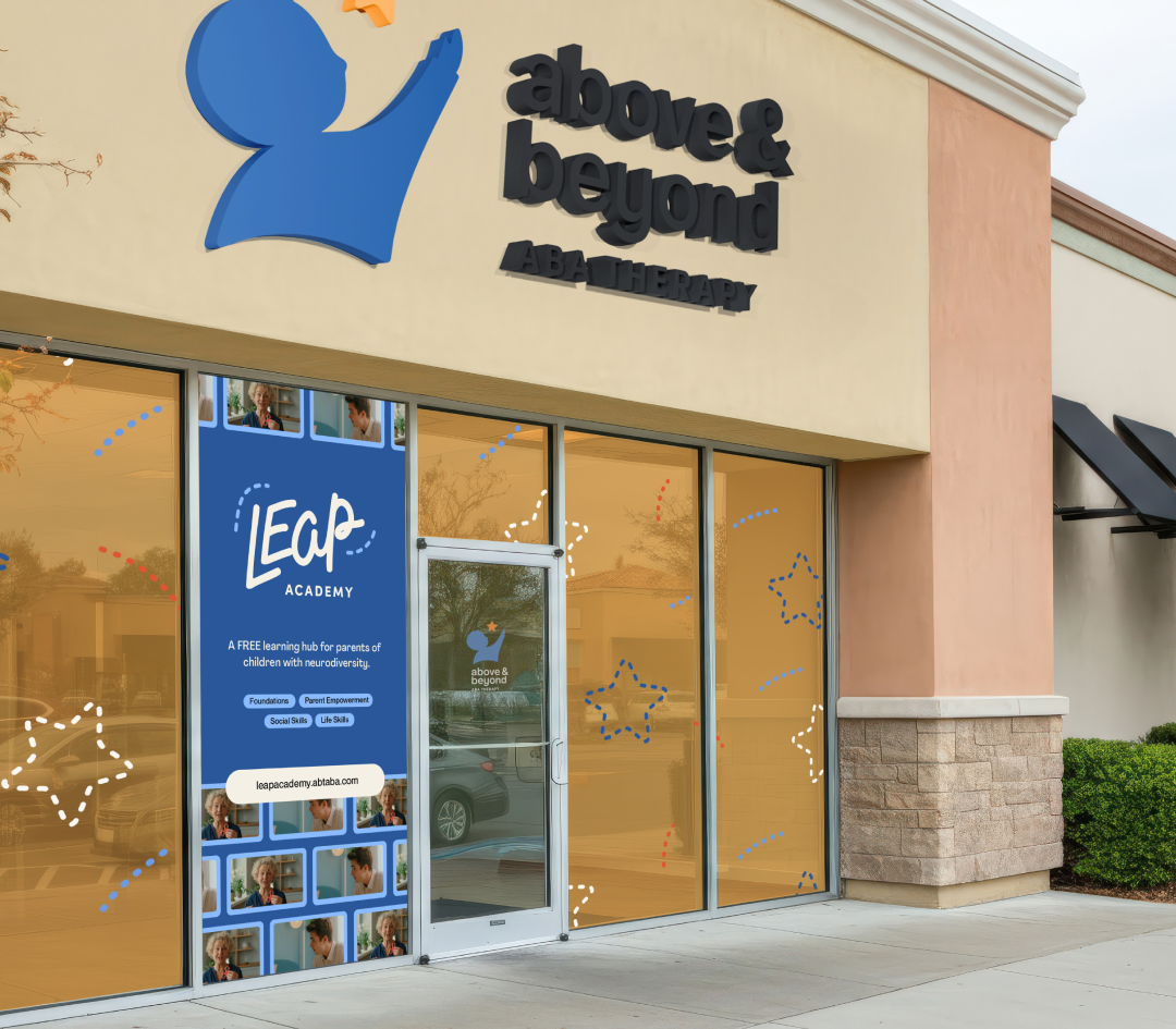
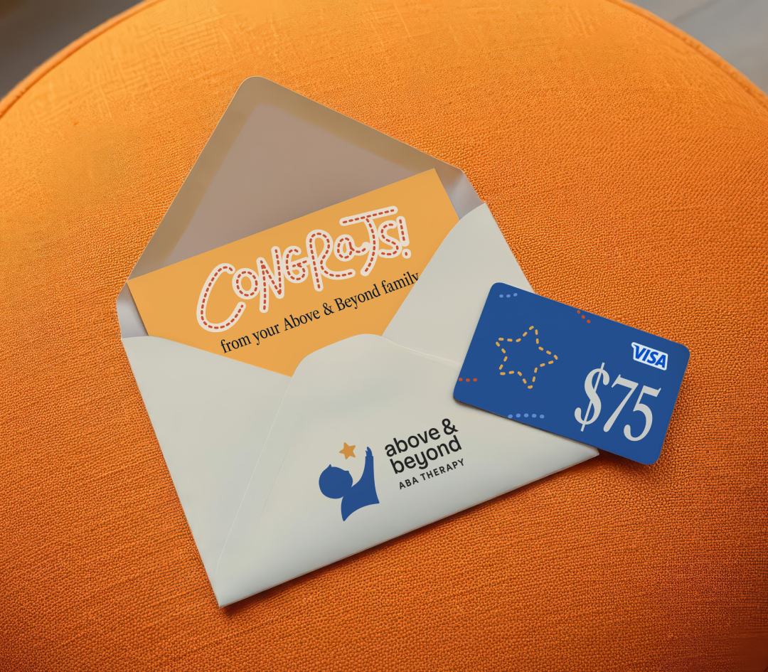
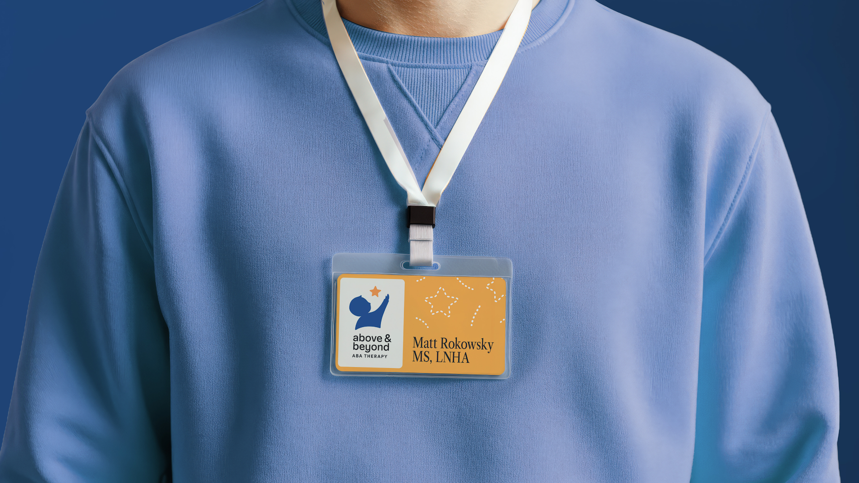
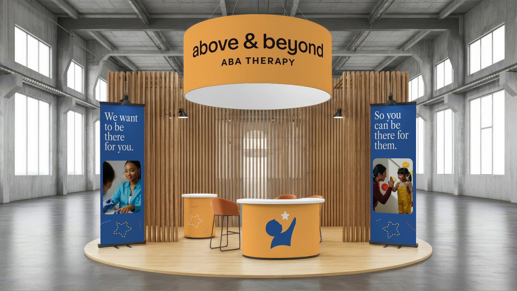
Beyond the core brand system, Motif created additional assets to help Above & Beyond refresh their presence everywhere families and partners encounter them — including trade show booths and physical materials. These touchpoints have been especially impactful, helping reposition the organization visually across the ABA landscape and reinforcing a brand that feels current, caring, and credible.
.svg)