

.png)
Let’s get one thing straight. It’s easy to get distracted and define “good” by some amorphous, personal definition. Good looks are important — but it’s the user experience that’s key to conversion.
We use neuro-scientific models to make our websites better. Let’s get into that.
The Fogg Behavioral Model, created by Dr. BJ Fogg, helps us understand human behavior in a straightforward way.
It suggests that behavior happens when motivation, ability, and prompts come together at the same time. For a person to do anything at all, they need to:
By using this model, we can build websites that not only attract visitors but also keep them coming back.
If you want your user to take action, like click a big red button, fill out a form, or purchase, they need to feel motivated.
Where does motivation come from?
We often go wrong by not understanding what actually motivates our target audience/users/ICP. The solution? More qualitative research. Get on the phone with your users to understand which features they actually like, or why maybe they should put homeless shelters somewhere else.
Read more about qualitative research in this post.
Can users easily complete tasks on your website? Don’t assume they can. Instead, sit down with someone who isn’t familiar with your service and ask them to complete a few tasks. Even basic forms can be riddled with errors.
Here are a few key areas to simplify:
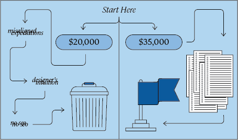
Always provide important info in a straightforward way to reduce cognitive load.
Always assume that someone is looking at your website at 3 PM on a busy workday before their next coffee. Because they are.
Put the most important information in the headline. And in the very first sentence. Our brains capture the most important information at the beginning. Effective front-loading can significantly improve engagement and retention.
.svg)
.png)
.png)