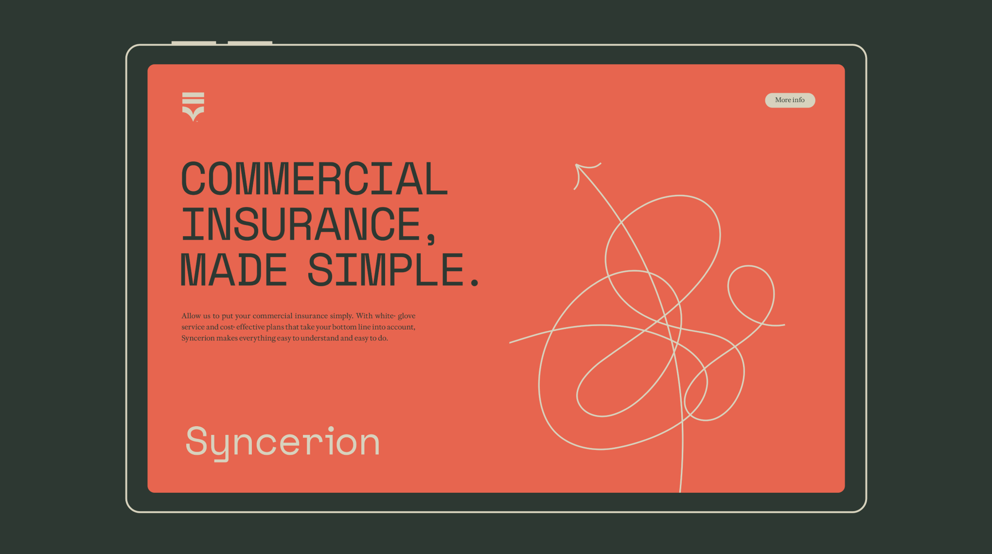
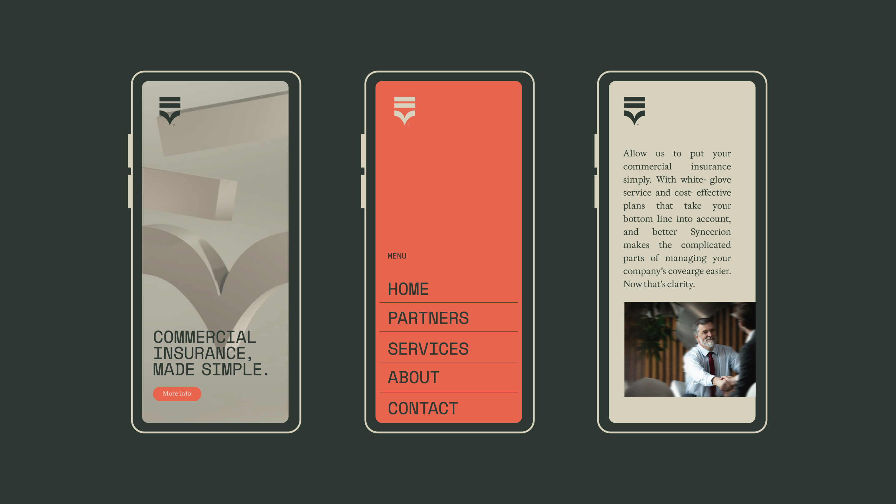
Syncerion is a P&C insurance brokerage specializing in the healthcare and LTC sector. With tailor-made insurance solutions and advisory services – as well as a well-earned reputation for honesty and straightfowardness – Syncerion protects its mid-market clients from the unpredictable nature of business. Along the way, Syncerion gives its clients a white-gloved hand, simplifying the tedious processes as much as possible and finding the best possible rates, protecting clients’ time as well.
trustworthy
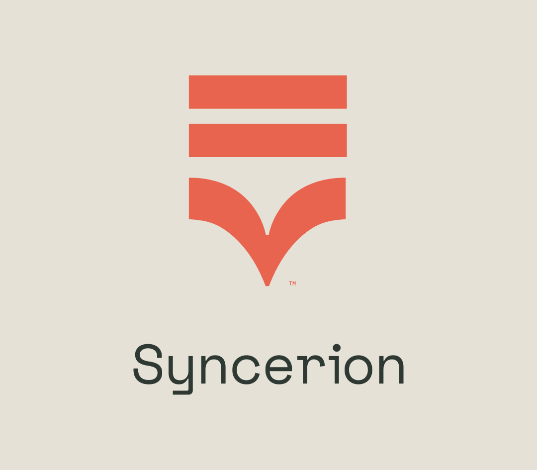
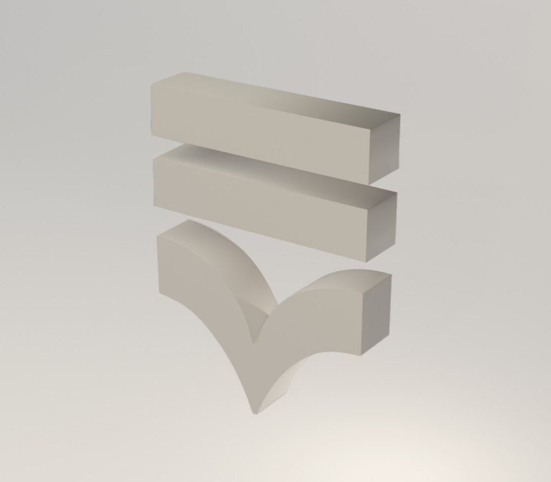
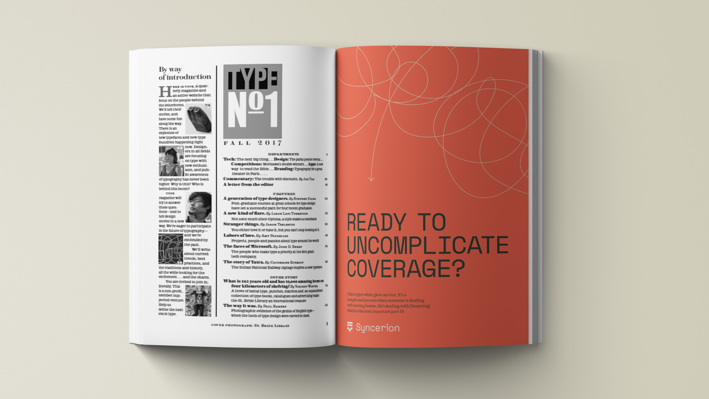
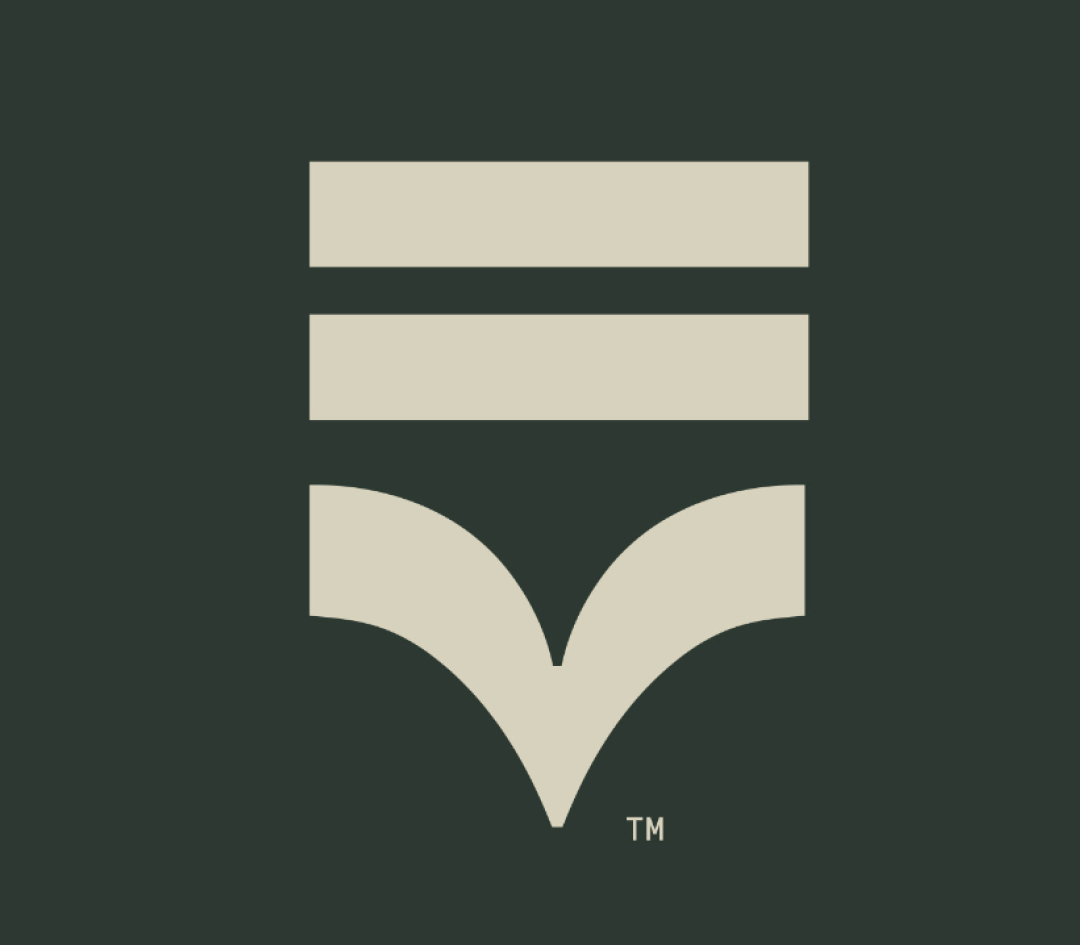
Although we want to evoke tradition, here’s one thing Syncerion wants to leave in the past: over-the-top, muddy language, whether in a brochure or a business speech. Syncerion is known for being straightforward and trustworthy, so we brought that out in the brand. The equal sign built into the logo's icon represents their honesty, while the messaging (Clarity in Coverage) and patterns represent the clarity and simplicity built into every process.
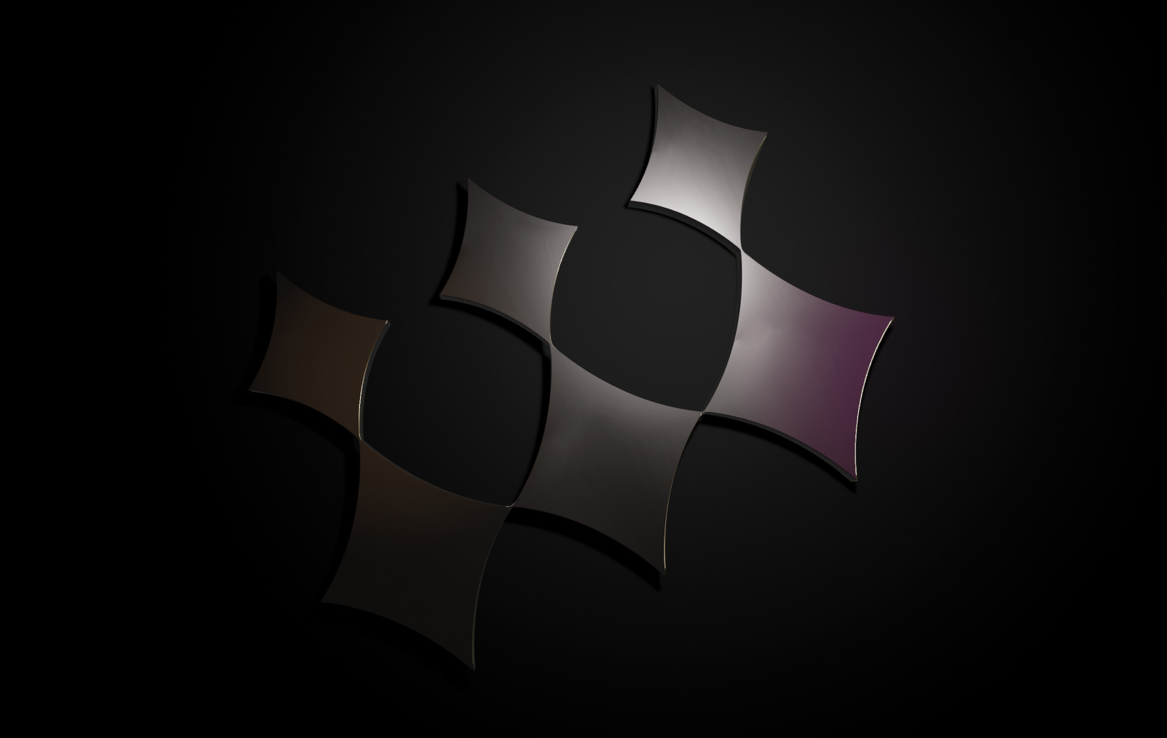
POWERFUL
By using dark tones, we create a strong, professional presence while keeping the look elevated and modern. Pops of brightness add energy and prevent the palette from feeling heavy or muted. The result is a brand that stands out for the right reasons — with strength, confidence, and clarity.


%20(1).png)
.png)

.png)
.png)

.png)
.svg)